Disclaimer: Any views expressed by individuals and organisations are their own and do not in any way represent the views of The Heritage Portal. If you find any mistakes or historical inaccuracies, please contact the editor.
Below is an absorbing and practical article looking at lettering on buildings. It was compiled by Dennis Radford for the October 1988 edition of Restorica, the journal of the Simon van der Stel Foundation (today the Heritage Association of South Africa). Thank you to the University of Pretoria (copyright holders) for giving us permission to publish.
Most Victorian signage in this country has been obliterated as, even if the building is still standing in a more or less intact condition, its owners have changed, products and services provided change and, most importantly, fashions change. All these have led directly to the destruction of historical signage. In restoration work even if the original signage is not to be restored some form of signage will usually be necessary and it follows then that it should be as authentic in its nature as possible. Beyond this it is also arguable that new signage on infill buildings in a conservation area should conform to a traditional layout and character. Most of what follows applies primarily to commercial and public buildings as signage on private houses was usually limited to numbers.
Historical Background
In the early 19th Century the Eastern Province was settled primarily by settlers of British stock. The initial 4 000 arriving in 1820 and 5 000 more coming between then and 1851. These people settled mostly in the towns and villages as artisans and merchants and it is they who would have required the services of a signwriter most to advertise their services and wares.
It is also worth reminding ourselves how long it took to establish these urban settlements. For example in 1827 Port Elizabeth consisted of 500 people concentrated principally at the foot of the Donkin Reserve. The numerous frontier wars added to the uncertainties. However growth was sustained and the area of the colony increased by pushing the frontier up to the Kei River ultimately.
The form and size of the various settlements during the 1840's and 1850's are graphically illustrated by the skilful sketches of Thomas Baines who was an inveterate traveller throughout the region and an accomplished recorder of the topography, natural and manmade. During the 1860's photography takes over as the most accurate recorder of the urban scene and it is during this time that the larger towns start to assume a more urban and sophisticated form. With the discovery of diamonds in the 1870's and gold in the next decade, the two seaports, Port Elizabeth and East London, shared in the almost frenzied prosperity of the country during the last quarter of the 19th century.
Signage in Britain during the 19th Century
In a largely illiterate society the primary form of signage was the making and displaying of symbols for the product or services offered. A surviving example until recently was the red and white striped barber's pole. However during the 19th century it became customary to supplement and finally to displace this with lettering.
Signwriting, that is the painting of lettering either directly on a wall or on a board fixed to the wall is of great age. It was certainly known in mediaeval times and then principally within churches. However it was only in the 19th century that it developed much more sophisticated forms and techniques. Commercial buildings in particular became liberally endowed with lettering in the larger centres of the English speaking world by 1850 as the example chosen illustrates. (See fig one - main image). As J Callingham, the author of a popular manual on the art observed in 1871: "ln these days of puffery, when each advertising tradesman is endeavouring to secure a monopoly of attraction to his announcements, the ingenuity of the signwriters is taxed to the utmost extent." The various letter faces developed and used during this time are dealt with below so a few words concentrating on technique will be appropriate here.
Firstly the signwriter always sets up his lettering free hand in chalk or pencil and never copied the printer's letters exactly as a bolder face was usually necessary. Setting out was done with two chalk lines, top and bottom which could be adjusted to take in irregularities. Some letter faces required four or even five lines. Blocked letters, that is with a painted raised outline were invented just before 1841. This was followed by shadows and then letters in perspective, all this increasing the visual impact of lettering very significantly.
By the 1870's a wide variety of pigments was available, the base being white lead. To this could be added ivory black, vegetable black, vermilion, rose madder, Indian red, purple-brown, French ultramarine, Prussian blue, yellow ochre, raw sienna, burnt sienna, van Dyke brown and emerald green just to name the principal pigments. These were mixed with turpentine as a thinner.
Certain rules of thumb were used regarding the combination of colours. Lettering on a ground of ivory black was considered superior. The major lettering could be in emerald green or carnation (vermilion and white) with secondary lettering in diluted purple. Plain gold or white lettering on a black ground was recommended. Lettering on a chocolate, Indian red or purple ground should be edged with gold or white lines around the letters themselves. White on black or black on white were standard combinations C1850 but by 1870 white lettering on a blue background was popular, this being with a black cast shadow. A stone coloured or white ground could have any colour of lettering except yellow. A cast shadow should never be of a positive red, green or blue but should be of a sombre tone, this being contrary to nature. Thicknesses on the other hand could be of brilliant colours.
Early Signage in the Eastern Cape
Bearing in mind the very small scale of all the early settlements including Port Elizabeth, it will come as no surprise to find that there appears to have been little in the way of signage on buildings. Presumably life just above a subsistence level did not require much in the way of extra goods and in a village everybody knew exactly what services were available anyway. The few travellers would just have to ask to have their needs met.
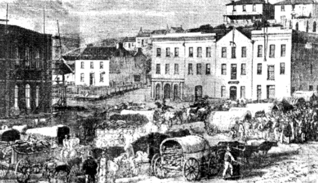
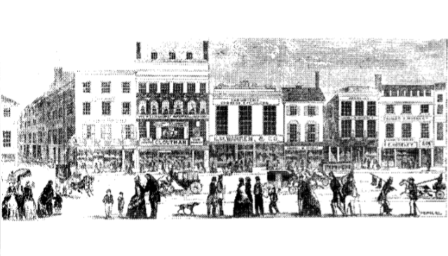
Views of Port Elizabeth and Grahamstown of the 1840's and 1850's show virtually no lettering on the buildings. In the case of Port Elizabeth however one building is consistently shown with a simple sign painted on its gable end. The word is 'hotel' and says it all. The view illustrated (fig two below) is of a corner of the market square in Port Elizabeth and dates from C1860. Although no actual lettering is visible small signboards can be seen fixed onto the walls of two of the buildings. This method may be taken as typical of the early period, that is prior to 1860. It would have been much easier then to paint onto a small wooden board with oil based pigments and then fix the sign to the side of a building. This method but on a larger scale persisted throughout the century. It was however largely replaced later on by the practice of painting directly onto the walls themselves. The lettering probably lasted much longer as the plaster formed an excellent base for painting upon.
Fig. 2. Port Elizabeth in C1860
Later Signage
During the late 1860's there appears to have been a slight increase in the size of letters which often approached 300 mm in height. Although still modest a greater area of the building also seems to have been covered. A greater variety of letter faces is also present, e.g. sans serif, ionic and perhaps Egyptian. By the 1870's there are also examples of blocking. In the 1880's yet more letter faces make their appearance along with shadows and possibly even perspective lettering. Building colours changed during this time with the introduction of cheaper oil paints. Quite dark tones such as browns, even chocolate browns, were favoured as the wall ground. By the 1890's even relatively small towns were boasting quite profuse examples of the signwriter's art. The following examples illustrate the above points more specifically.
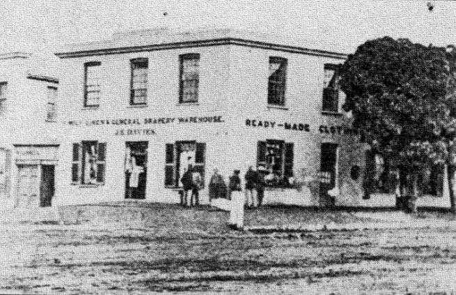
Fig. 3. Building on the corner of Bathurst and High Streets Grahamstown C1865
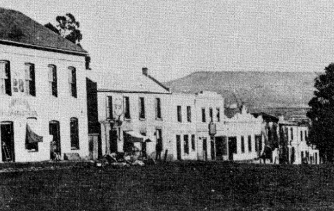
Fig. 4. Hill Street Grahamstown C1870
The first illustration (fig three) is of a building on the corner of Bathurst and High Streets in Grahamstown. The photograph dates from C1865. The building itself is not white but of light tone. The lettering is in two faces, sans serif for the upper lettering while J E Davies is in ionic. The position midway between the ground floor window lintols and the first floor window cills is typical. The signs are also carefully symmetrical with the building. The next example (fig four) is also in Grahamstown, in Hill Street, the photograph dating from C1870. It shows the earliest example of blocked lettering I have been able to find so far, that below the number 28. Both this lettering and that on number 26 are much more imaginative in their layout than that shown previously. Both are also obviously the work of the same man.
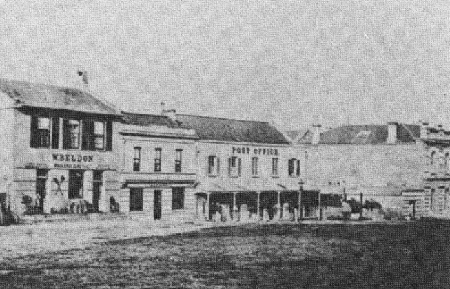
The face used on the post office and W Beldon (fig five) are early examples of the use of Egyptian. Both are slightly condensed, that is more vertically elongated than was usual. Much smaller sans serif lettering is used for the minor signwriting below Beldon's name which itself must have approached 400 mm in height. The middle building's signage is not readily decipherable but that above the window is clearly white on a dark background.
Fig. 5. Post Office Port Elizabeth
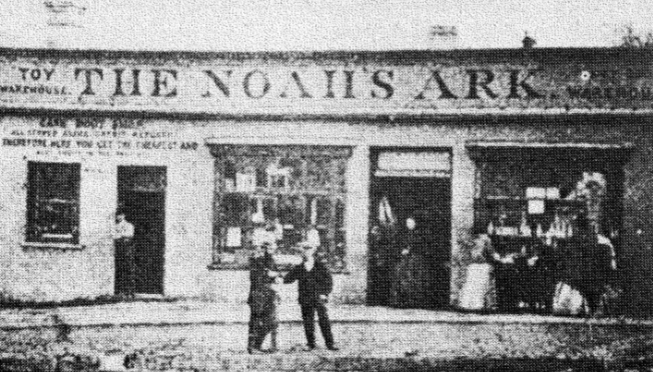
The signage on the shop the Noah's Ark in Grahamstown must date from before 1870 (fig six). The principal lettering is in ionic, the rest in sans serif of varying heights and thicknesses. There also appears to have been signage painted on the glass fanlight above the main door. This would be an early example.
Fig. 6. Noah's Ark Grahamstown
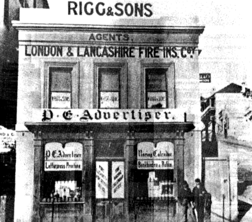
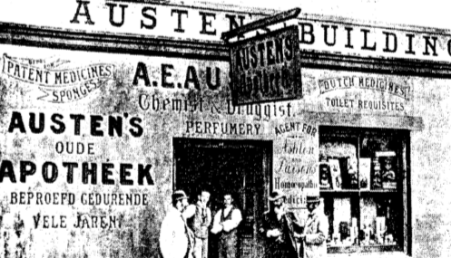
The last two examples date from C1890, one in Port Elizabeth (fig seven) and the other in Cradock (fig eight). Both illustrate well the more profuse, late 19th century commercial signwriting. A great variety of letter faces are used and in the Port Elizabeth example much of the glazing has been painted over to form a light ground for signwriting. Note the diagonal lettering on the front double doors. The Cradock example uses five letter faces plus blocking and a variety compositional devices to attract and entertain the eye. However there is still a clear hierarchy and little visual confusion and certainly no monotony. In this way it can be compared to a comtemporary poster.
Fig. 7. Shop in Port Elizabeth C1890
Fig. 8. Austen's Building Cradock
Some Common Lettering
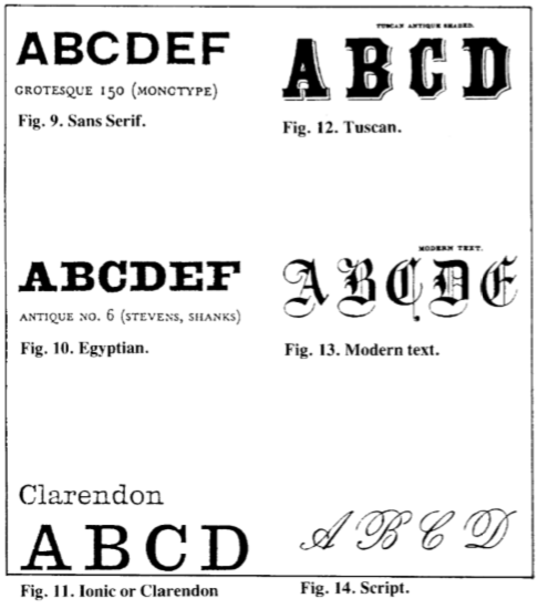
The most widely used letter face was that termed sans serif or grotesque. This is the most rudimentary form of letter (see fig nine). It is even line and right angled. The earliest record of its use in England is C1816 and came into common use from 1836 on. It was often termed doric from its dour ruthless form. Around mid century a lighter form was evolved. The letters are made from rectangles with the 0 a perfect circle. Shading was used to add to its expression. It can also be compressed so that it is expanded horizontally. This face is still in use. Examples can be seen in figs three, four, seven and eight.
The next most common face was Egyptian. This is essentially an architectural letter face (see fig ten). To some this is the best so far invented. It would seem to have been invented by signwriters at the end of the 18th century and then copied by the typographers. The face is very three dimensional and is held to be very much an English creation. It is a heavy letter, square in section, with an even line and unbracketed slab serifs. Monumental in form it integrates well with classically inspired buildings. Examples can be seen in figs five and eight.
Figs. 9-14
Another common 19th century face was ionic or Clarendon. This was a cross between Egyptian and Roman. Here the pointed ends are blunted (see fig eleven). Clarendon is a mid 19th century type face which is often too thin if used in architecture. An early use in England was on the College of Surgeons (1835-40) in London. It is still used in modern design and was especially favoured in the 1950's. The face has been called 'balanced, quiet and self respecting'. Examples can be seen in figs three, six and eight.
A less common face was Tuscan. This is a so-called fat face normally of proportions 5:1 the thin stroke being a hair line. Very characteristically the serifs are curled with bi- or trifurcated terminations. Again it is an architectural invention with English examples common from 1840 onwards. It is an expressive letter with a wide range (fig twelve). Examples are not shown but there was at least one example C1880 in Grahamstown.
Another less common face was that known as modern text. This was obviously calligriphic in origin (see fig thirteen). It was known by 1870. A local example slightly modified is seen in fig seven.
The last face worth mentioning is script (see fig fourteen). Based on handwriting it was generally used for minor lettering and is seen in that capacity in fig eight.
Conclusion
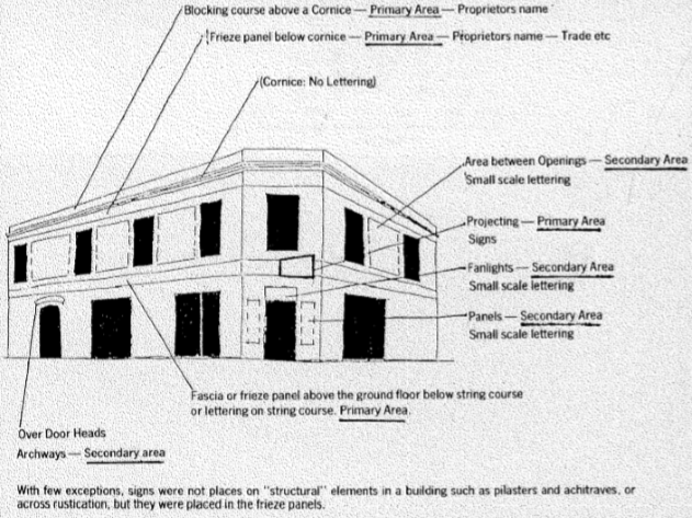
Rather like the architecture that it adorned, lettering became more varied and profusely used as the century wore on reaching a virtual crescendo in the last decade or so. It was however mostly used in sympathy with the architecture and seldom obliterated or clashed with the building's form or scheme of ornament (see fig fifteen). Its use in the Eastern Cape appears to have been uniform with no distinct regional variations as yet apparent. Preliminary research would also seem to indicate that its form was not that different to that of the rest of the Cape or even the rest of the British Empire.
Fig. 15
Comments will load below. If for any reason none appear click here for some troubleshooting tips. If you would like to post a comment and need instructions click here.

